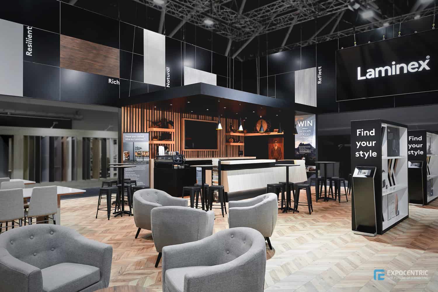
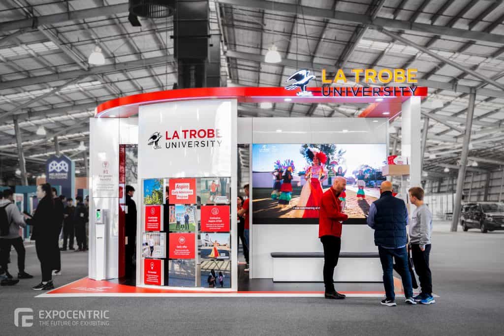
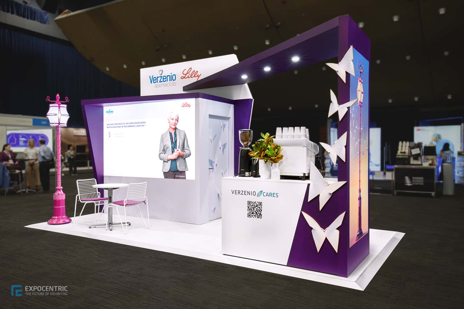
Whilst a strong marketing strategy gets you to trade shows, it is the design of the exhibition that makes a lasting impression. The offer of a shell scheme may seem tempting when a checkbox magically creates some walls and sign to call home, however no one (and trust us, we know), walks away from a shell scheme remembering it for its design. A custom exhibition stand is a different story. If designed correctly it’s effervescent atmosphere will be remembered well into the future.
Appreciating a well designed stand is one thing, understanding how to design an exhibition space is another, and one we have lots of experience (and tips) with. Following are five tips your business should focus on when looking to design the perfect exhibition stand.


Tip 1: Set your Objective
Ahead of the design process, companies must focus on the objectives of the project. This will take into consideration both the creative and functional purpose of the stand. The idea behind your exhibition should table all of the project’s potential opportunities.
Following are few tips on understanding what objectives your company could look to achieve whilst onsite:
Sell Products and Product Trial
If many of the company’s clients or warm leads are already attending the event, the business should look to use the event as an opportunity to convert sales, or trial new products.
Lead Generation
If the company is looking to tap into a different industry, they should look to use their exhibition space as an opportunity to generate more sales and build their database.
Product Education
If the company is launching new products, or a leader within the industry with their technology, the company should look to use the exhibition setting as an educational opportunity.
Understanding the parameters of the company’s objectives whilst being onsite will in turn advise the functional design of the exhibition setting.


Tip 2: Understanding the Exhibition Space Design
With the event objectives confirmed, consideration should then be given to how the exhibition space should be laid out to best achieve these objectives. Utilising these same objectives, the following will provide tips on how the stand layout should be designed.
Sell Products and Product Trial
The objective of selling and trialling new products should result in the design of a stand that balances both the facilitation of product testing and the success of undisturbed conversation.
Lead Generation
Generating leads requires adequate space for the team to liaise with visitors when at the exhibition. The space should be supported by lead generation tools, including smart screens or a desk for team staff to utilise. The space should be light and inviting, encouraging customers to step into it and work to harness meaningful conversation.
Product Education
Consideration should be given to the type of space required to educate and what materials to incorporate. This may include standing room or seating materials to allow an audience to engage with product education. Additionally companies may like to review the requirement of screens to showcase this information or the space to provide demonstrations.


Utilising the objectives strategically highlights exhibiting isn’t simply working within the space you have, rather it looks at ideas to optimise how a space can be designed to better facilitate the focus of the business.


Tip 3: Deliver the Key Message
How a business delivers their messaging at the exhibition will noticeably affect the success of the event. Following are two primary forms of messaging that companies can integrate into their stand design, with tips for best practice within.
Print Material
Bold images should be utilised within the stand to capture the attention of the average visitor. Remember the saying “A picture speaks a thousand words?” Keep this in mind when selecting images to reflect your company and their focus. Companies should consider showcasing new products and services within their graphics especially if these cannot be showcased onsite. It is important to remember that print material utilised should display a consistent brand identity that explains the purpose behind the company.

Digital Media Messaging
It comes as no surprise the impact of digital messaging on a stand. Utilising animations and videos within exhibitions can work to capture a broader audience passing by. Video content can be showcased within an exhibition stand through branded content on TV screens, projections onto the stand space or within educational slideshows.
LED screens are now a cost effective option that allows seamless integration of light, graphics and movement into an exhibition stand and works to set your stand apart from the rest. Further information on our LED screens can be seen here.
TIP: Too much messaging within an exhibit can be more detrimental than not enough, ensure the messaging remains clean and sophisticated to have the biggest impact.
A combination of messaging whether it be print or digital will piece together the look and feel of the exhibition space, and will work to make an impression that lasts beyond the trade show.

Tip 4: Exhibition Experience Engages Visitors
The exhibition design is not only about creating an eye-catching display for visitors to remember, it also includes the integration of activities visitors can engage with. The design of the space should invite the visitors from the event to both visit the area and keep them engaged with it.
When considering the design of an exhibition in terms of experience, understand the movements of an attendee when they visit the stand and ensure their needs are met at each stage. A typical walk through may include:
- Capturing their attending using a bold image
- Ensuring staff meet and greet visitors in the exhibition space
- Walk visitors through and encourage the participation of interactive elements
- Provide them content to walk away from the stand remembering your brand.


The space should aim to harvest a complete experience from the moment a visitor steps onto an exhibition stand to the moment they leave and eliminate any constraints. Ideas should be created to drive visitors onto the exhibition space, and the layout should reflect this. For example exhibitions may include a barista and coffee machine to build a sense of warmth. The physical exhibition build may also work to engage the visitor, for example including a QR code within the walls, drawing visitors to a gamification experience or to learn more via the business’s website.

The design of the exhibition space doesn’t always need to be creative-led, subtle inclusions like power banks near seating may work to enhance the experience of the visitors, and further extend their stay within the stand.
The experience a visitor has within the exhibition works to unify both the messaging a company is trying to portray and create a memory for the visitor to walk away with.
Tip 5: Create an Experience that will be Remembered
Designing an exhibition space involves a myriad of concepts to meet the needs of both functional and design-focused elements. A final step that all designers should consider is how the brand will be remembered. Whilst we are aware of a number of tips to market a company well into the future, the exhibition design should look to explore this strategy.
Be Functional
Physically, exhibitions should develop ways for visitors to share their attendance. This may be through photo opportunities created within the stand that encourage images to be shared across social media. Additionally the design of the stand should look to facilitate connection with new leads. This may include automatically requesting contact details before visitors utilise an interactive piece. The engagement and design of the stand should work hand in hand to provide content that attendees want to share within their network moving forward.

Be BOLD
Finally, be BOLD. An exhibition is not remembered because it looks the same as every other stand. Be brave with your design and do something daring. Of course, keep within your brand guidelines to maintain your brand identity and never clutter the stand. Instead, create a design that will make a statement.
The project of designing an exhibition stand has gone from overwhelming to inspirational in a matter of minutes. Using the aforementioned tips, place together the non-negotiables, and start to build out the design requirements of the stand. Still find it overwhelming? That’s what our Expo Centric designers are for. We understand what the objectives are for your projects and are ready to listen to any tips (and stories) you have for us about your business. With this knowledge in mind, we can work with you to design the perfect exhibition stand for your audience.

